01
Aurora
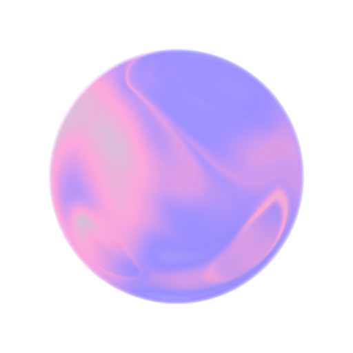
Our surfaces. Translucent, atmospheric, with light passing through. Depth without visual weight. The material that defines every card, every modal, every pill in Aiden.

We've redesigned everything. Here's the story.
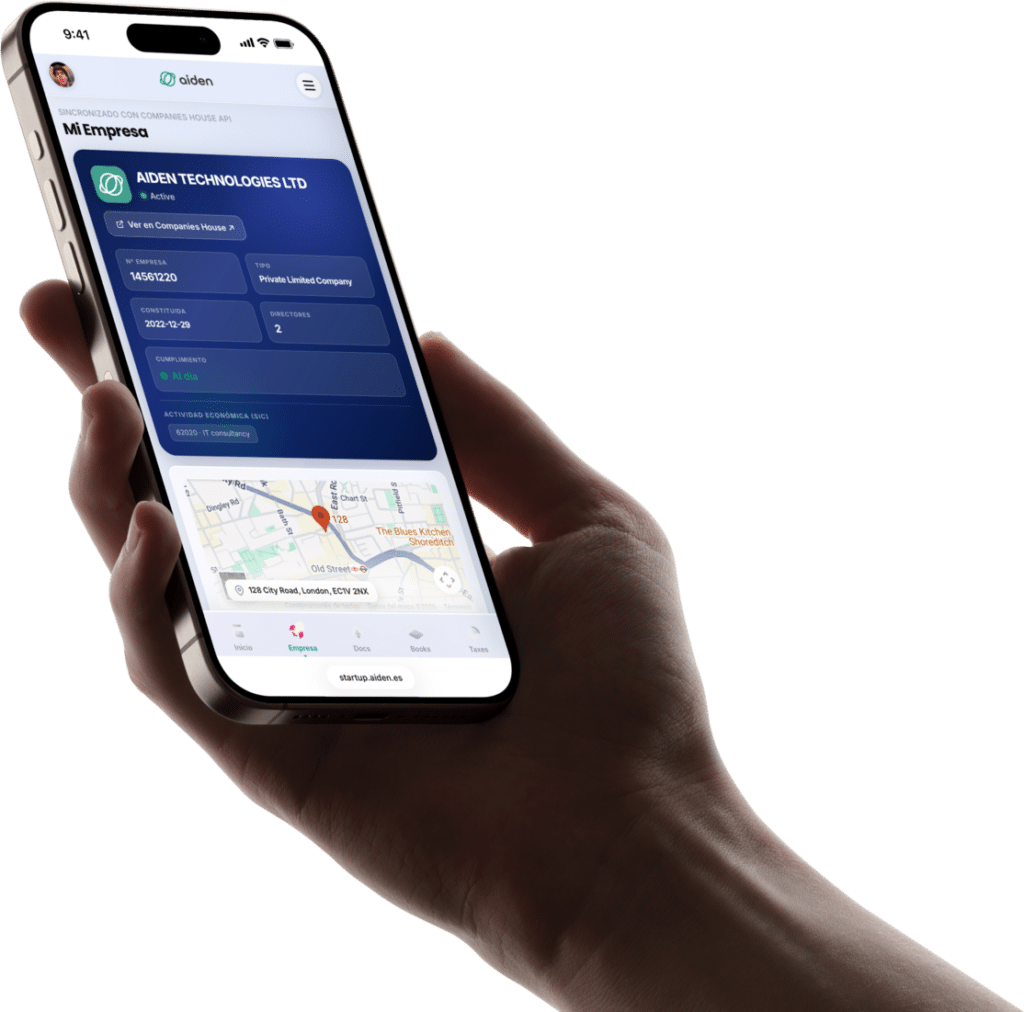
For months we've rebuilt Aiden Startup's identity from the ground up. New typography, new palette, new component system. A visual language that reflects exactly what we do: radical transparency, serious technology, and founders treated with respect.
This isn't a facelift. It's a new brand perspective.
Four ideas run through every pixel of the new design system.
Our surfaces. Translucent, atmospheric, with light passing through. Depth without visual weight. The material that defines every card, every modal, every pill in Aiden.
The brand's motion. Continuous pills that flow fluidly between states with cubic-bezier(.16, 1, .3, 1). Every transition shares the same cadence.
Sora 800 for headlines with editorial weight. Figtree for body copy with maximum readability. Negative letter-spacing on display for a modern density.
Real prices. Clear features. Honest comparisons that admit when another option is better. Transparency is the product.
Teal as the primary color: trust, growth, calm. Warm accents for emotional nuance.
#E6F5F2#CCEAE5#99D5CB#66C0B1#33AB97#13967E#0E7A67#0A5E50#074237These aren't mockups. They're the real components from the design system. Click the interactive ones.
Every page is an exercise in consistency. Step in and explore.
Technical details for those who stick around until the end.
backdrop-filter: blur(32px) saturate(1.5) · fallbacks for Safari/Firefoxcubic-bezier(.16, 1, .3, 1) · scroll reveal · 6s infinite gradient shimThe new Aiden Startup is already up and running. Explore, discover, and tell us what you think.
Usamos cookies para medir el uso de la web y mejorar nuestros anuncios. Puedes aceptarlas o rechazarlas. Política de cookies